A Twitter conversation this week reminded me that it’s not always easy to cite data or maps you may use in your reports, papers, or theses. As a result, I revisited and updated a web resource I put together 10 or more years ago that lists sample citations for GIS maps and data, and points to other web resources with formatting guides: Citing Geospatial Data Remember, you will need to choose a citation format acceptable to your instructor, advisor, or journal editor.
Category Archives: Publications
Introduction to GIS course – first module
I am working on developing a series of self-paced GIS training modules. This first effort is designed for users who have never used ArcGIS before, and is a very simple introduction to using ArcMap.
The data are available to download here.
There is also a link to the data download in the exercise.
More updates and material to follow… You will need access to ArcMap 10.1 and have an Internet connection to complete this module.
How to update an ArcGIS student edition license
If you are running your own copy of ArcGIS – the Student Edition – the license is valid for one year. It is possible to renew your student license without re-installing ArcGIS or obtaining another install DVD. You will first need to get a new registration code. These are available by sending an email to it-help or to mdhyslop at mtu.edu
Detailed instructions for activating your license are available as a PDF: How to update an ArcGIS Student Edition license.
Please email mdhyslop with questions or comments.
Free ebook – learn statistics with R
http://health.adelaide.edu.au/psychology/ccs/teaching/lsr/
A link to the ebook in pdf format, an order form for a hard copy, code used in the examples, and more can be found at the page above.
A new look at the election map
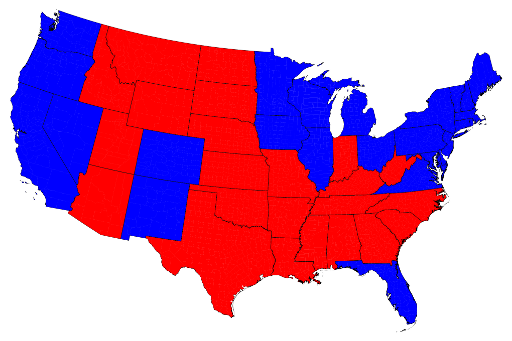
Many of you have probably seen one form or another of the U.S. election results maps in the last decade, showing red vs. blue states (or counties), with areas won by the republican candidate shaded in red and those by the democratic candidate in blue.

State by state U.S. Presidential election results, 2012 Source: http://www-personal.umich.edu/~mejn/election/2012/
It’s easy to be ‘misled’ by a map, however, in this case because the colors are applied to states that have very different characteristics (area, total population, population density, and population distribution). The red – vs – blue areas appear to be about equal (and it was a close election) but the map is not as factual as it could be. Is it more accurate to show results on a county by county basis?

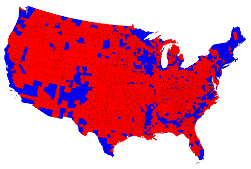
County-level results for the 2012 U.S. Presidential election Source: http://www-personal.umich.edu/~mejn/election/2012/
On this map, the red areas vastly outnumber the blue, giving the appearance of a republican victory. Clearly, looking at the results using counties instead of states does not produce a more accurate map. What’s missing? Population density.

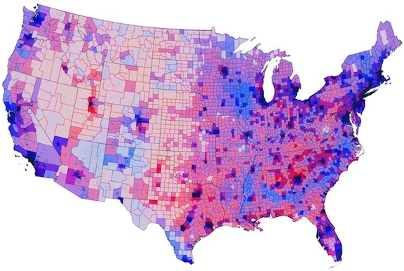
Election results mediated by population density.Source: http://www.theatlanticcities.com/politics/2012/11/political-map-weve-been-waiting/3908/
In the above map, the darkness of each color indicates how densely populated a county is. The vast areas of the Great Plains are very sparsely populated, appearing almost white in some parts, whereas the urban centers on the west and east coasts (look at Long Island), as well as in the Great Lakes, have much higher populations and are therefore very dark.
If you are interested in seeing more examples of these maps, I suggest you explore the article showcasing the population density map at The Atlantic Cities, Mark Newman’s election web site (U of Michigan), or Robert Vanderbei’s maps of the 2012 election (Princeton). At these sites you will find cartograms, county maps shaded to show voter split (purples where the vote was close to 50-50), animations, and more.
Humorous map – USA seen from a New York perspective
This is from “Funny or Die” but worth passing along. Be sure to look at the larger version: http://www.funnyordie.com/articles/a106c8188f/the-map-of-america-as-seen-by-a-new-yorker
NPS launches Park Tiles, an NPS basemap
http://www.nps.gov/npmap/blog/introducing-park-tiles.html
“Park Tiles is not meant to be a total replacement for any of the basemaps we currently use. It is, rather, meant to give us an alternative basemap we can use in custom projects where we’d like to see our National Parks highlighted. We’d also like to incorporate more detailed park information (such as campsites, visitor centers, trails, etc.) at larger scales that can serve both NPS employees and visitors.”
First found on Spatially Adjusted
Dot map of Census data
A new dot map of USA and Canada Census data has been published recently. See http://bmander.com/dotmap/ for more details.
New (free) e-book – Agent Analyst: Agent-based modeling in ArcGIS
Available with some background information from gisandscience.com or directly from ESRI
I haven’t tried the extension or any of the exercises yet, but look for tutorial files in the future if it seems useful.

