http://health.adelaide.edu.au/psychology/ccs/teaching/lsr/
A link to the ebook in pdf format, an order form for a hard copy, code used in the examples, and more can be found at the page above.
Monthly Archives: February 2013
ArcGIS Spatial Analyst Supplemental Tools
ESRI has released a set of custom tools for the Spatial Analyst extension. Read the announcement or download them directly.
New tools include Create Dendrogram, Draw Signatures, Filled Contours, Maximum Elevation Upstream, and Viewshed Along Path tools. ArcGIS 10.1 SP1 is recommended.
A new look at the election map
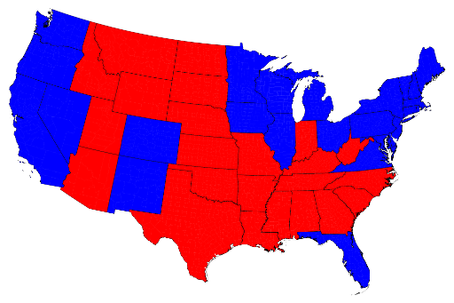
Many of you have probably seen one form or another of the U.S. election results maps in the last decade, showing red vs. blue states (or counties), with areas won by the republican candidate shaded in red and those by the democratic candidate in blue.

State by state U.S. Presidential election results, 2012 Source: http://www-personal.umich.edu/~mejn/election/2012/
It’s easy to be ‘misled’ by a map, however, in this case because the colors are applied to states that have very different characteristics (area, total population, population density, and population distribution). The red – vs – blue areas appear to be about equal (and it was a close election) but the map is not as factual as it could be. Is it more accurate to show results on a county by county basis?

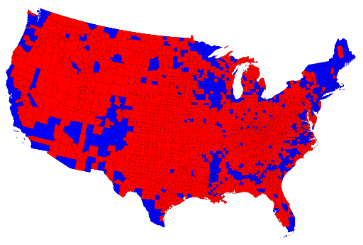
County-level results for the 2012 U.S. Presidential election Source: http://www-personal.umich.edu/~mejn/election/2012/
On this map, the red areas vastly outnumber the blue, giving the appearance of a republican victory. Clearly, looking at the results using counties instead of states does not produce a more accurate map. What’s missing? Population density.

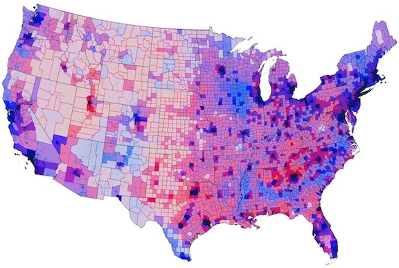
Election results mediated by population density.Source: http://www.theatlanticcities.com/politics/2012/11/political-map-weve-been-waiting/3908/
In the above map, the darkness of each color indicates how densely populated a county is. The vast areas of the Great Plains are very sparsely populated, appearing almost white in some parts, whereas the urban centers on the west and east coasts (look at Long Island), as well as in the Great Lakes, have much higher populations and are therefore very dark.
If you are interested in seeing more examples of these maps, I suggest you explore the article showcasing the population density map at The Atlantic Cities, Mark Newman’s election web site (U of Michigan), or Robert Vanderbei’s maps of the 2012 election (Princeton). At these sites you will find cartograms, county maps shaded to show voter split (purples where the vote was close to 50-50), animations, and more.
Humorous map – USA seen from a New York perspective
This is from “Funny or Die” but worth passing along. Be sure to look at the larger version: http://www.funnyordie.com/articles/a106c8188f/the-map-of-america-as-seen-by-a-new-yorker
NPS launches Park Tiles, an NPS basemap
http://www.nps.gov/npmap/blog/introducing-park-tiles.html
“Park Tiles is not meant to be a total replacement for any of the basemaps we currently use. It is, rather, meant to give us an alternative basemap we can use in custom projects where we’d like to see our National Parks highlighted. We’d also like to incorporate more detailed park information (such as campsites, visitor centers, trails, etc.) at larger scales that can serve both NPS employees and visitors.”
First found on Spatially Adjusted
URISA student competition
The Urban and Regional Information Systems Association, URISA, is again hosting its annual student paper and poster competition:
“URISA hosts an annual Student Competition to encourage students in a variety of academic settings and disciplines to write and publish papers and posters to share with the URISA membership and others in the geospatial technologies industry. The submission may include research projects, case studies, projects, or any type of methodology in which geospatial technology and skills were used or could be used.”
See http://www.urisa.org/student_competition for more information. The submission deadline is June 3, 2013.
