Add the Buffer Wizard to an ArcMap toolbar

Earlier version of ArcGIS had a ‘buffer wizard’ tool available. This functionality is now housed in the tools “Buffer” and “Multiple Ring Buffer” found in ArcToolbox > Analysis > Proximity. However, if you prefer the wizard interface, it is still possible to add the Buffer Wizard to a toolbar in ArcGIS. The instructions below are for ArcMap 10.x

  • Customize > Customize Mode…
  • Click the Commands (center) tab
  • Scroll down in the Categories list until you find Tools. Click once to select it.
  • Find the Buffer Wizard in the Commands: list on the right
  • Drag the Buffer Wizard icon to any existing toolbar (I suggest the “Tools” toolbar) and drop it wherever you like
  • Clicking the Buffer Wizard icon will launch the wizard…

You can customize any ArcMap toolbar in this fashion. See the ArcGIS help topic “adding a command to a toolbar or to the main menu” for more information.

DNRGPS released – replaces DNRGarmin

The Minnesota DNR released DNRGPS on February 15, 2012 and has already issued an update to fix some functionality problems. DNRGPS is the long-awaited replacement for DNRGarmin 5, and is designed to address incompatibilities between ArcGIS 10 and DNRG. It will also work with GPS units not manufactured by Garmin, Inc, prompting the name change.

DNRGPS is written as an Open Source application, and utilizes other open source software for portions of its core functionality (notably gpsbabel and GDAL). The developers are still working on updates to the program – be sure to read the known issues, release notes, and help file found on the application’s web page.

DNRGPS requires Windows XP or Windows 7, and works with ArcGIS 10 and Google Earth. Long-time users of DNRGarmin will want to do some testing before using DNRGPS on a daily basis. The move to open source underpinnings has changed how the software operates, notably how projections are handled. The ArcGIS toolbar is no more, but Geodatabase functionality has been added.

Stay tuned for more impressions and tutorial data.

ArcGIS Geoprocessing tools

Long-time users of ESRI products may remember the “Geoprocessing Wizard” tool that was available in ArcView 3.x and in ArcGIS 8. Though it was handy to have these common analysis tools in one location, this wizard was removed in ArcGIS 9 and the associated tools were ‘relocated’ to other toolboxes.

The functions of the Geoprocessing Wizard included: MergeClipIntersectUnion, and Buffer

These tools may be found in the following toolboxes (both in ArcGIS 9 and 10):

Merge: Data Management Tools > General > Merge
*the Merge tool was called ‘Append’ in ArcGIS 9.0 and renamed in version 9.1 and later
Clip: Analysis Tools > Extract > Clip
Intersect: Analysis Tools > Overlay > Intersect
Union: Analysis Tools > Overlay > Union
Buffer: Analysis Tools > Proximity > Buffer (or Multiple Ring Buffer)

A fix for ‘script errors’ when running tools in ArcToolbox

I recently was made aware of a fix for the long-present problem with ArcGIS on domain machines (i.e., users log in to lab or office machines using their ISO password) where a script error is generated every time a tool in ArcToolbox is opened. After dismissing three error dialog boxes, the tool will run ‘normally’. Not a fatal error, but annoying.

The problem stems from Internet Explorer, and can be fixed by replacing two files in \program files(X86)\ArcGIS10.0\ArcToolbox\Stylesheets

A description of the fix and the replacement files are available from http://support.esri.com/en/knowledgebase/techarticles/detail/38099

Administrator privileges are needed to implement the fix.

Cartograms – a different method of representing spatial data

A cartogram is a map produced using a cartographic technique where the mapped polygons (e.g., county or state boundaries) are stretched or shrunk based on the magnitude of the variable being mapped. This distortion of area can make odd-looking but more representative maps.

One great example of cartograms is from Mark Newman of the University of Michigan. His presidential election maps put a new twist on the “red state vs blue state” maps that have been a staple of TV news election coverage since 2000.
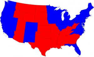
2008 election, red-vs-blue states

Map of states carried by Obama (blue) and McCain (red) in the 2008 Presidential Election. source: http://www-personal.umich.edu/~mejn/election/2008/

The above map shows whether the majority of voters chose the Republican candidate (in red) or the Democratic candidate (in blue) in the 2008 Presidential election. The size of the mapping units – the states – do not indicate the underlying population, however, and a larger area of the map appears red.

In the map below, the size of each state is altered based on its population. The less populous western states (the Dakotas, Wyoming, Montana…) are reduced in size, while the more densely populated states are increased. Though the shapes of some states are warped significantly, most are still recognizable, and the map gives a more accurate picture of the election results.
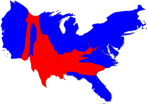
Cartogram of 2008 election results, with state size modified by population. source: http://www-personal.umich.edu/~mejn/election/2008/

All maps are produced using a series of compromises (map scale, data generalization, color choice…)  and statewide election maps do not tell the whole story. Dr Newman has county-based election results maps on his web site that show more details – I encourage you to explore them. He even makes the software for producing them available for free. See also this post from ESRI that discusses cartograms, with a link to an ArcGIS tool for producing cartograms.

To see some cartograms for other areas of the world, visit Worldmapper

I have one final comment on the “red states vs blue states” maps. Having grown up during the Cold War, I find it very bizarre that red has become associated with the Republican Party. “Red” was connected to Communism: the U.S.S.R., China, and the general Communist threat. On the Mercator Projection map of the world (which greatly inflates the size of high-latitude countries, such as the USSR) that hung on my grade school wall, Communist countries were colored red. Not the color I would ever expect the GOP to embrace. Times change, I guess…

ArcGIS tips document

ESRI has created a nine page ArcGIS Desktop Tips and Shortcuts document. It lists keyboard and mouse shortcuts for many common operations, and identifies which work for versions 9 and 10 of ArcGIS (ArcMap and ArcCatalog). A shorter list is available in the ArcGIS 10 application help files. Tap F1 when ArcMap is running and search for keyboard shortcuts.

You can also use the Help files for ArcGIS 10 in the ArcGIS Resource Center. Search for keyboard shortcuts. Help for other versions of ArcMap (or other ESRI applications) can be found by going to the ArcGIS Resource Center and clicking Help. Expand the list for the application you are interested in (click the +) for help files from the older versions.

Tip: the help files from the Resource Center are the most up-to-date for all ESRI software. Sometimes updated documentation is not included with service packs and patches, but these files are kept current.

ESRI Community Analyst available (soon)

Found in a recent press release from ESRI:

Easy-to-Use Tools Help You Understand Local Issues

Students in colleges, universities, and K–12 schools throughout the United States now have access to Community Analyst through the Esri Educational Site License program at no additional cost.

Community Analyst includes demographic, health, economic, education, and business data for the entire United States, allowing students to study individual neighborhoods within their own communities or compare their communities with others. Because Community Analyst is completely hosted in the cloud by Esri, it eliminates the need for software installation and data management and ensures that students always have access to the latest features and data updates.

Existing educational site license holders should contact the Esri Site License administrator at their institutions for instructions on accessing Community Analyst.


Please note that licensing details are not yet available. Please stay tuned for more information. Community Analyst requires ArcGIS 10.


Advanced ArcMap labeling techniques

There’s a new blog entry at ESRI’s Mapping Center that describes how to use variable depth masking to improve the readability of labels on data-dense maps. In the article, a contour map is created with variable depth masking applied to the labels. This technique hides portions of layers under the labels, which makes them easier to read. An ArcInfo-level license is needed to use variable depth masking.

Borders and changes in technology

A history of the US-Canada border (which brings to light some realities of surveying in the 1800s) was recently posted on the NYT blog, found here. For more historical border issues (errors later pointed out using newer technology – GPS), see the Deseret news and the NOAA response.

The NOAA rebuttal is an interesting argument: even though a specific monument (the Four Corners marker that sits between Utah, Colorado, Arizona, and New Mexico) is at a location other than its intended coordinates, it doesn’t invalidate the boundaries between these states, nor does the meandering of the US-Canada border along the 49th parallel call into question the location of the border with our northern neighbors. The (connected) monuments, placed between 1872 and 1874, define the boundary, even if they do ‘wander’ across the parallel.

Given the tools surveyors had to work with in the 19th century, and the terrain they were crossing, the border between Minnesota and Washington is amazingly straight. It’s the development of newer tools (GPS and Google Earth, among others) that lets us discover such errors with relative ease.

On a final note, the Four Corners is a unique place in the U.S. It was even parodied in an episode of The Simpsons.